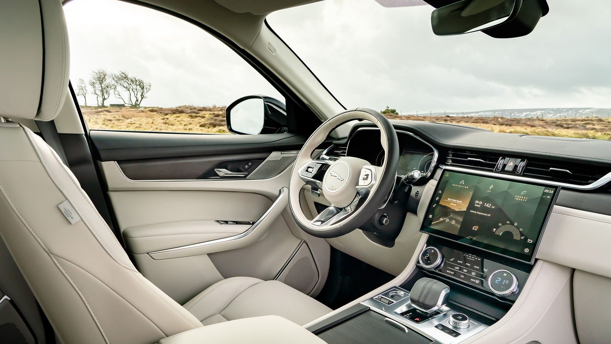
Jaguar F-Pace Hybrid interior
The latest F-Pace is vastly improved inside over the outgoing car, and it needed to be. The plug-in version is no different
Style

One of the biggest criticisms with the previous F-Pace was that the disappointing cabin design and quality took away from its attractive exterior and polished drive. Clearly Jaguar listened, as it’s no more.
In its place is an interior that makes the old car look like some sort of cheap Chinese knock-off. Jaguar has now nailed the ‘mini-Bentley’ feel inside, with plusher trim and upholstery and more premium colours and finishes. You’ll certainly impress your mates if you’re upgrading from, say, a Seat Ateca.
The plug-in hybrid version is identical to the standard car, save for different drive mode switches and some hybrid-specific dial graphics.
Infotainment

Part of the visual drama is the F-Pace’s new 11.4-inch curved touchscreen. It’s located nicely on the dash to help when driving and make integrate it seamlessly into the sleek design. All models from the entry level have it fitted, so there’s no need to worry about upgrading.
BMW’s iDrive and Mercedes’ MBUX systems are both a bit easier to use while driving thanks to their multiple control choices, but as touchscreens go, Jag’s effort is sharp, responsive and very easy to navigate. Importantly, Apple CarPlay and Android Auto are both standard.
Cars higher up the range also come with slick digital driver’s dials and a rearview mirror you can flip from a standard glass reflection to a camera mounted on the tailgate. It looks cool, but also works well. It’s a shame the steering wheel buttons are a tad fiddly to use, though.
The plug-in hybrid gets new displays that show you information on charging, range and powertrain details. Other than that, it’s the same story.