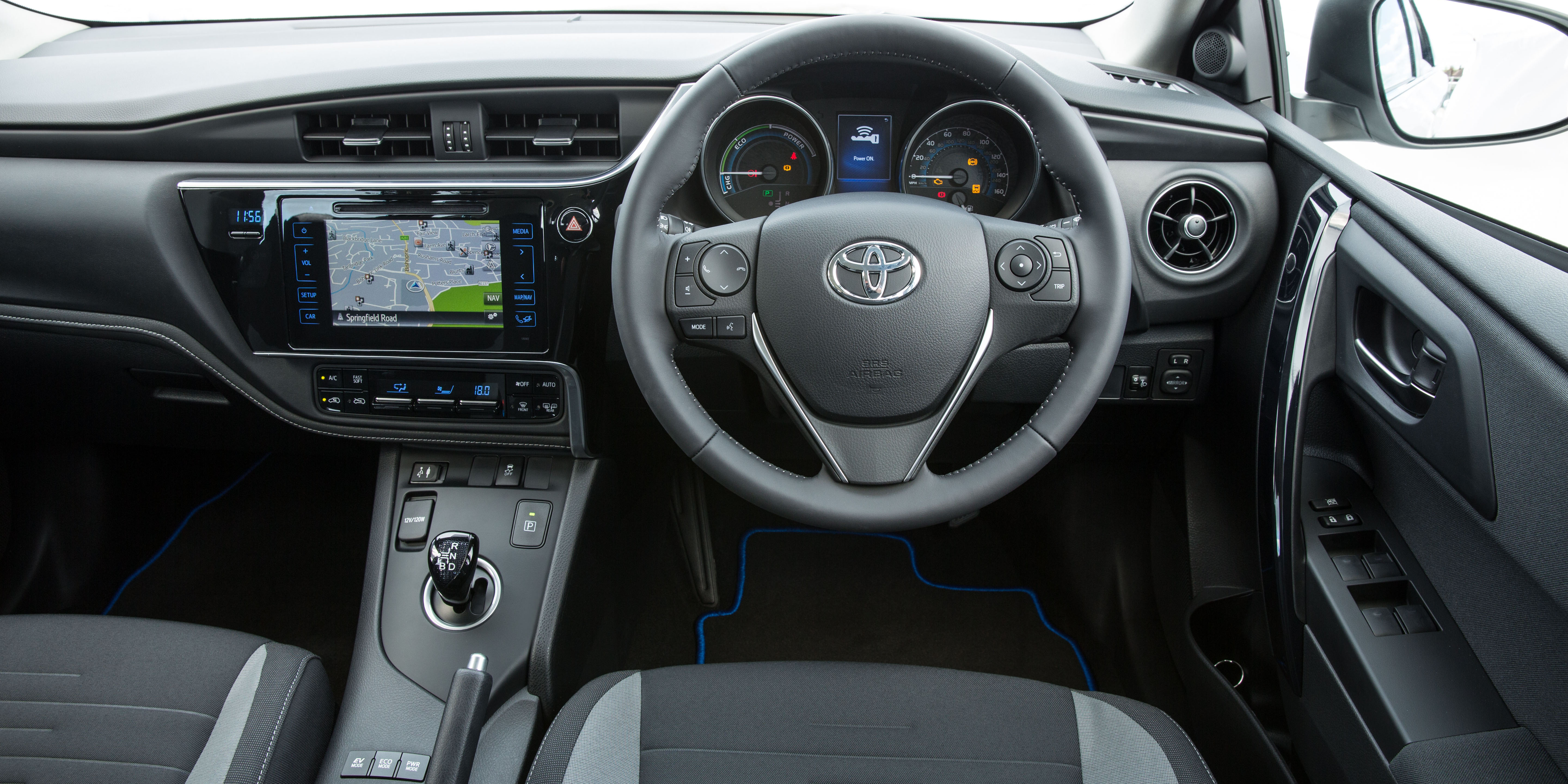
Toyota Auris interior
In the spirit of starting as you mean to go on, the Toyota Auris’ interior is perfectly adequate if a little uninteresting.
Style

The Toyota Auris dash is dominated by a flat panel of piano black plastic that houses the infotainment screen and a clock readout that would look dated on an early ‘80s digital watch. Climate controls are, mercifully, physical buttons that are easy to use on the move.
Material quality is reasonably good but, again, doesn’t stand out. A Mazda 3 features similar feeling plastics on the centre console and dash but we heard very occasional squeaks and rattles in our test car’s cabin that wouldn’t be found on Mazda and Honda rivals. The dials are clear and easy to read but the screen nestled between them features some rather dated looking graphics.
The Auris interior is well built and functional, but a little too Yawnsville for our liking
- Used
- £4,120
Infotainment
Watch our Toyota Auris interior and infotainment video review
All versions except the entry-level car come with Toyota’s Touch 2 seven-inch touchscreen infotainment system, which makes the interior look more hi-tech, while the rest of the dashboard’s controls are sensibly laid-out and easy to operate.
Toyota’s Touch 2 infotainment system with a seven-inch touchscreen is standard on all but the entry- level model. It adds an air of modernity to the otherwise dated interior, but it’s in a completely different league to rivals, in particular, the VW Golf. It’s like comparing an iPhone 4 to a 7.
- Used
- £4,120