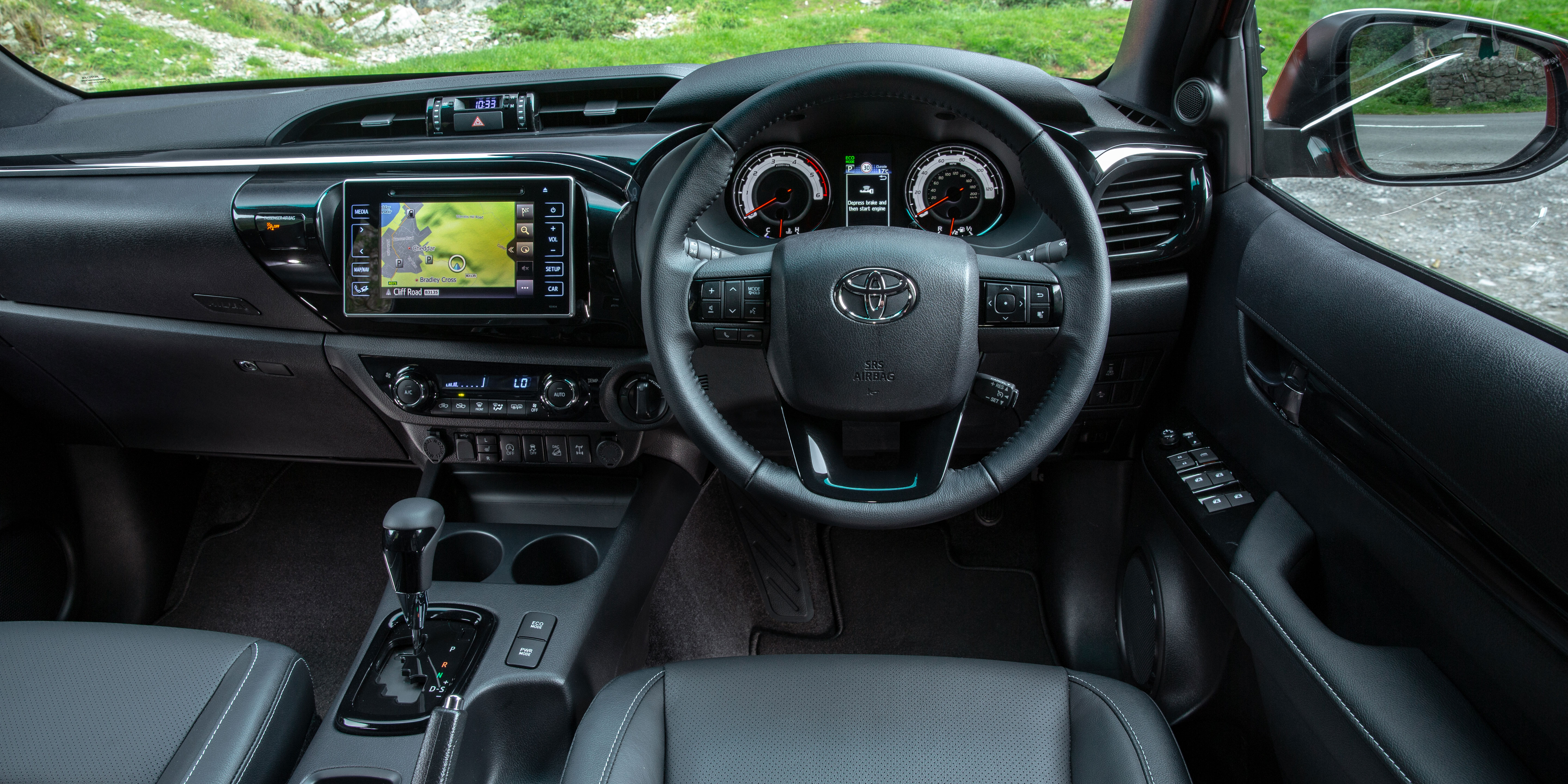
Toyota Hilux interior
Besides entry-level trucks, the Toyota Hilux comes with a well-equipped cabin. It doesn’t feel particularly plush though, and the infotainment can be a real pain to use.
Style

Unlike some trucks that look just as chunky and tough on the inside as they do on the outside, the Toyota Hilux’s cabin feels much more like it belongs in a Corolla hatchback than a high-riding pickup.
You get a slick-looking dashboard with a set of nicely recessed instruments and a row of sensible physical heating and ventilation controls tucked beneath the stereo.
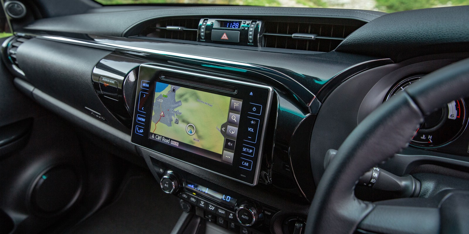
Speaking of which, the stereo is a fairly basic unit in entry-level Active models, but Icon versions and above come with a nicer-looking 7.0-inch touchscreen infotainment system and an extra 4.0-inch display within the rev-counter and speedometer.
These mid-range trucks also come with a bright silver trim stretching across the dashboard and doors along with a leather-trimmed handbrake and gear lever. Invincible models don’t add any visual upgrades as standard, but they do give you the choice to pay extra for a range of five leatherette seat coverings.
If you fancy real leather seats, you’ll have to go for a top-spec Toyota Hilux Invincible X. These are also heated and come with electric adjustment as standard. Little else separates these high-spec models from more affordable alternatives, however. You get the same basic cabin layout the numerous plastic surfaces feel harder and scratchier than those in a VW Amarok.
That said, every part of the Toyota Hilux’s interior feels like it’ll stand up to a good few years of abuse.
The Toyota Hilux’s interior doesn’t follow the pickup norm – in mid-range trucks, at least. Instead of blocky features and angular edges, it’s all swooping curves and glossy details.
Infotainment

Entry-level Active versions of the Toyota Hilux come with a basic stereo system comprising a radio, a CD player and a Bluetooth connection, but not DAB digital radio. It might look smarter than the similar systems you get in the likes of the Ford Ranger, but its touch-sensitive buttons make it much trickier to use on the move – especially if you’re wearing gloves.
The upgraded system you get in Icon versions and above has plenty more features, but isn’t any easier to use. The screen is colourful, but not particularly sharp and the menus aren’t as easy to navigate as those in a VW Amarok. It doesn’t respond particularly quickly either and you can’t get it with Apple CarPlay or Android Auto smartphone mirroring.
You can pay extra for sat-nav in Icon and Invincible trucks – or go the whole hog and grab yourself an Invincible X model where it comes as standard – but it isn’t all that intuitive. Sure, entering an address using the on-screen keyboard is pretty simple, but it’s a real pain to swipe across the map to preview your route ahead and the map graphics can be confusing at junctions and complicated intersections.