Toyota Verso interior
The cabin is well built, but some materials are lower-rent than in rivals and the design isn’t that modern.
Style

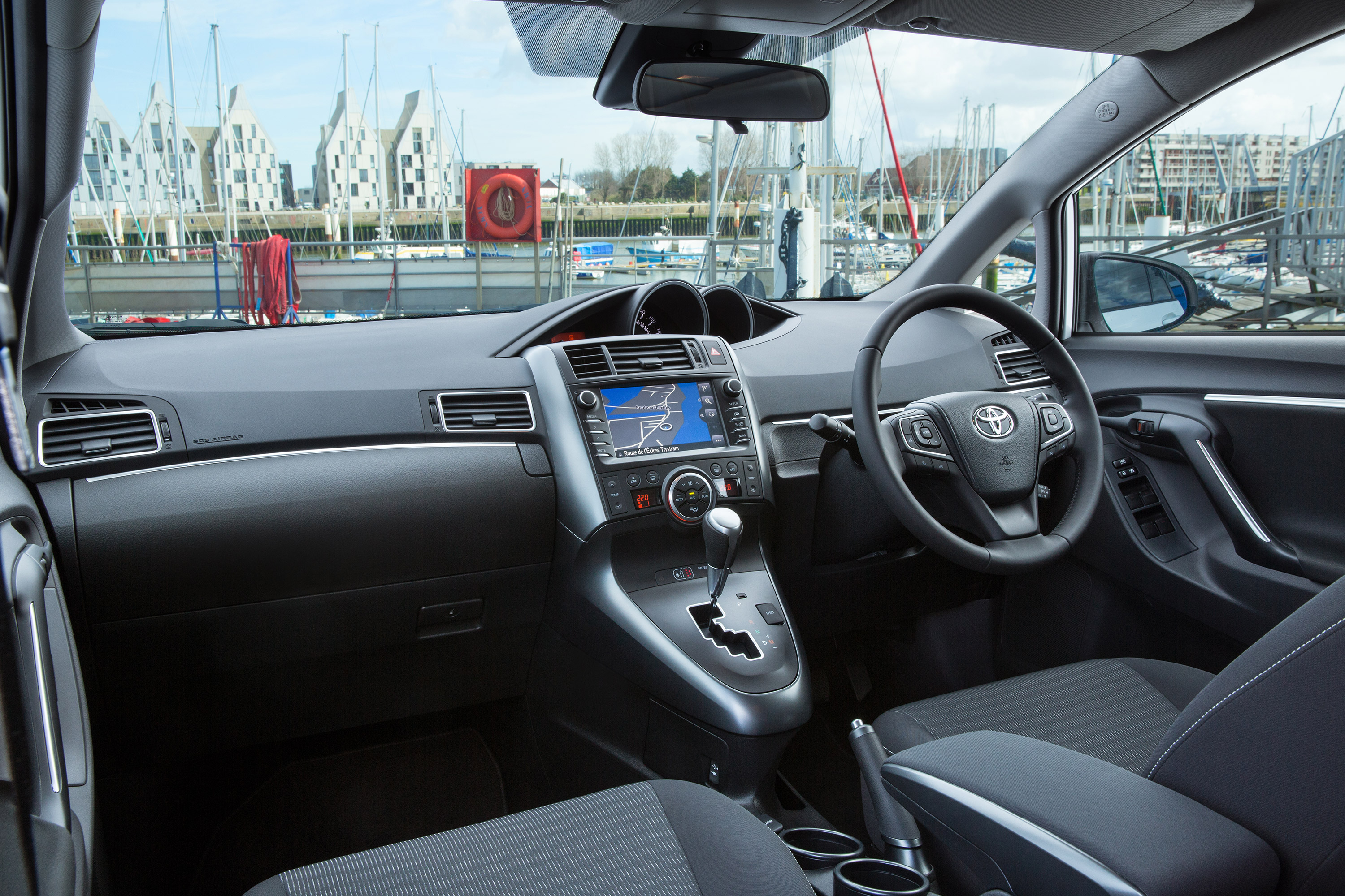
The general build quality inside the Verso is hard to fault – everything feels well screwed together and there are no rattles from trim pieces over bumps. The centrally placed dials are clear, easy to use and, because they’re recessed into the dash, avoid any unwanted glare in strong sunshine.
It falls down in terms of style, however. When so many rivals are pulling out all the stops to make sure their cabins look special in addition to feeling sturdy, the Toyota’s is disappointing. The dashboard is dominated by unpleasant black plastic, while all the lighter pieces feel made from especially cheap plastic.
The naff design is further let down by the switchgear. Black plastic buttons look as though they could’ve been lifted from a Toyota of the early ’90s. The layout is intuitive enough but there’s no excuse for such a dull cabin when similarly priced rivals feel as well built and offer even a small modicum of style.
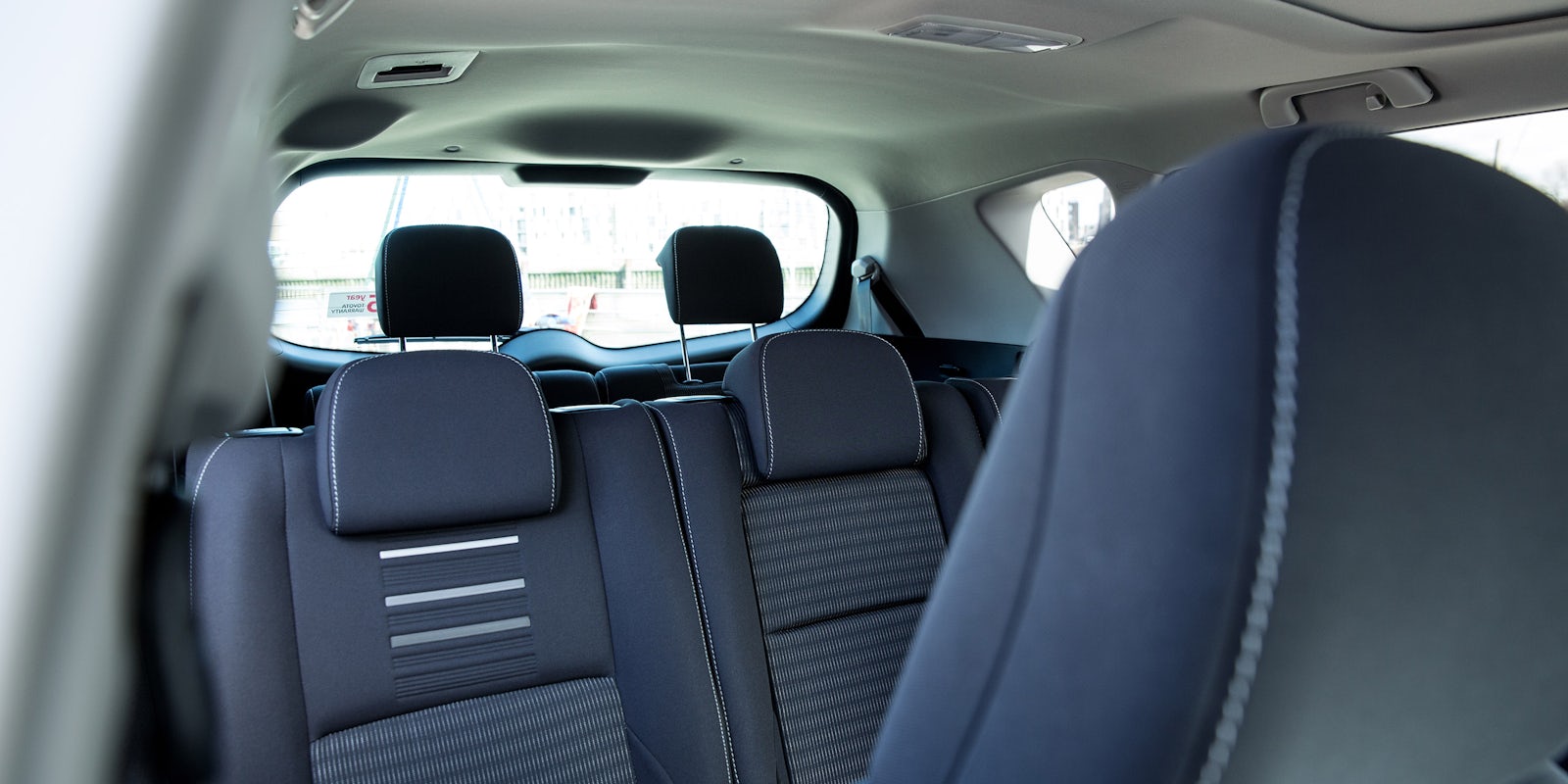
Good passenger space while having three individual middle seats makes it easy for those with more than two small children
- Used
- £10,600
Infotainment

The Touch 2 infotainment screen, which comes as standard on all models apart from entry-level Active, is easy to use, with a clear and bright screen. The only issue with it is that it can dazzle occupants in low sunlight.
- Used
- £10,600